
Cocoon
Color & Consumer Insight Direction
The cocoon represents a moment of pause—of protection, transformation, and becoming. A space where identity is held, reshaped, and redefined before it emerges into something entirely different.
This direction explores a collective shift—toward intention, presence, and deeper connection—and how that shift translates into color, material, and form.
Taking insights from consumer mindsets and behaviors, this directive pulls from products and trends from across wellness, fashion, home, and beauty and distills the key colors shaping a more intentional society.

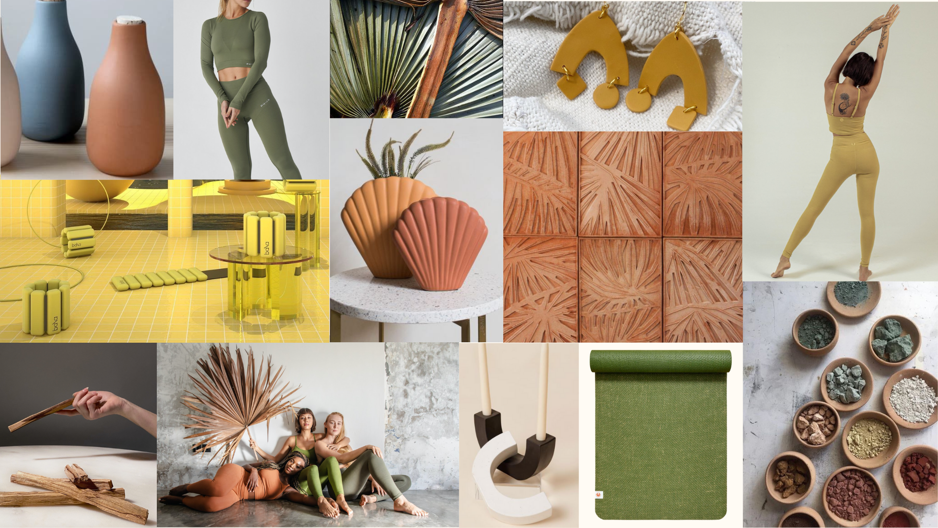
Color direction emerges through emotional states—each reflecting a shift in how we live, create, and connect.
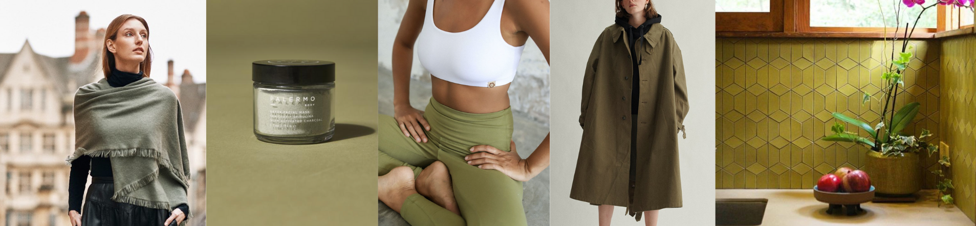
Nurture
Color Direction 01
Green signals a return to nature—evoking calm, restoration, and quiet optimism. Softened with warmth, it carries a sense of ease and emotional safety while still feeling alive and energizing.
As we seek reconnection—to ourselves, our environments, and a slower pace—this tone becomes a grounding presence, bringing balance across product, space, and the body.
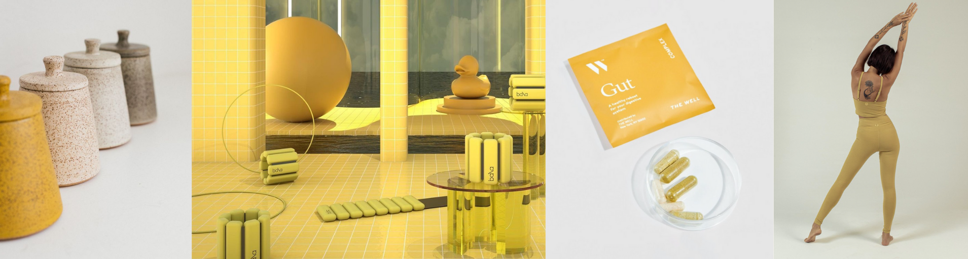
Clarity
Color Direction 02
Softened yellow introduces lightness, direction, and subtle optimism. Rather than demanding attention, it offers quiet clarity—guiding without overpowering.
It functions as a point of contrast within the palette, bringing energy and focus while maintaining balance.
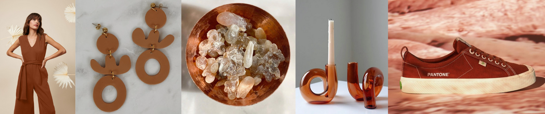
Reflection
Color Direction 03
Warm, earthen reds signal a deeper turn inward. Rooted and contemplative, this tone speaks to stillness, processing, and the quiet integration of experience.
It carries both strength and softness—inviting a slower, more intentional relationship with material, form, and self-expression.
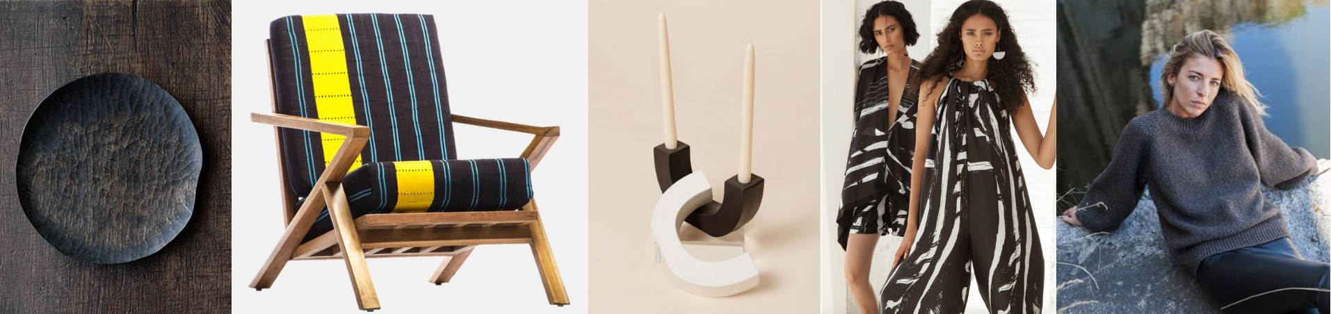
Grounding
Color Direction 04
Deep, saturated browns anchor the palette—offering stability, reassurance, and depth. Less severe than black, they introduce warmth and humanity while maintaining structure.
Grounding tones create a sense of permanence, reinforcing a connection to natural materials and a desire for longevity in both product and design.
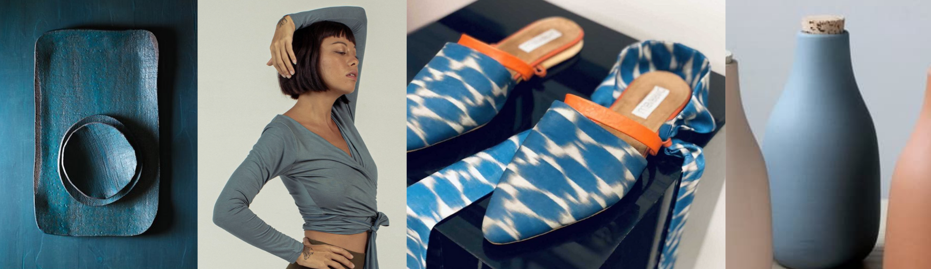
Connection
Color Direction 05
Muted blue brings a sense of openness and trust—reflecting a growing desire for authenticity, transparency, and meaningful connection.
It feels calm but expansive, bridging physical and digital spaces while supporting a more thoughtful, collective way of engaging with the world.